Mobile App · Beauty & Wellness · 2026
Glowva
A booking app for salons and barbershops in Bahrain, designed so a confirmed appointment replaces standing in line — from the first sketch to a tested, shipped mobile flow.
Role
Solo Designer
Interviews
5 users
Timeline
~4 weeks
01 — Discover
Five conversations, one shared complaint.
I started by talking to 5 young people in Bahrain about how they actually get a haircut or a beauty appointment. Different salons, different budgets, different routines — but every single one of them landed on the same critical point without being asked directly about it: nobody likes waiting in line once they get there, because there was never a real way to know how long the wait would be, or whether a slot was even available before showing up.
Defined problem
Users do not like waiting in line at barbershops or beauty salons to get their haircut, and want a convenient way to book appointments.
Defined solution
We believe that creating a convenient booking app will eliminate the need for users to wait in line.
02 — Explore
Starting low-fidelity, on purpose.
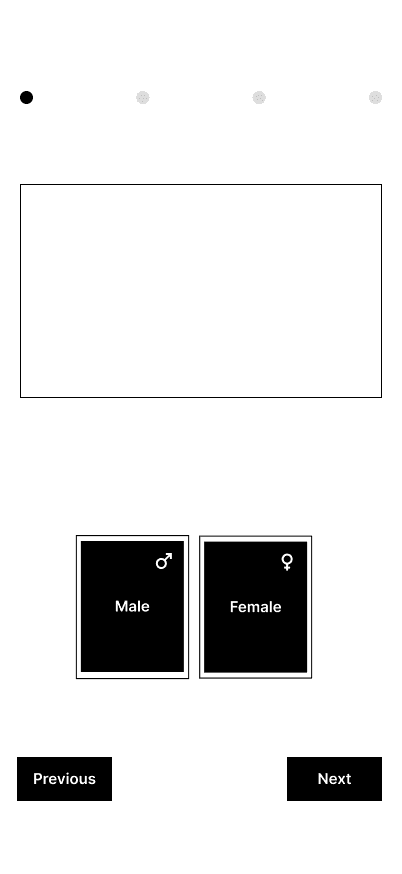
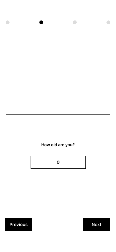
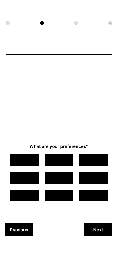
Before touching a single color or icon, I sketched the onboarding and booking flow as bare wireframes and put them in front of the same 5 participants. Low fidelity meant nobody got distracted critiquing visuals — every note was about whether the flow itself made sense.
What testing changed
I ran the wireframes back past users after every round. Three changes came directly out of that loop:
Before
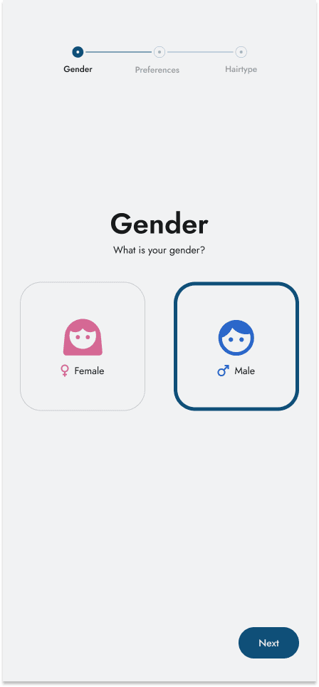
Personalization was one long form — name, age, gender, preferences on a single screen.
After testing
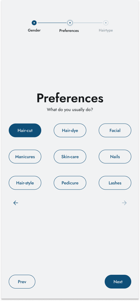
Split into one decision per screen with a progress stepper, so it reads as a short conversation, not paperwork.
Before
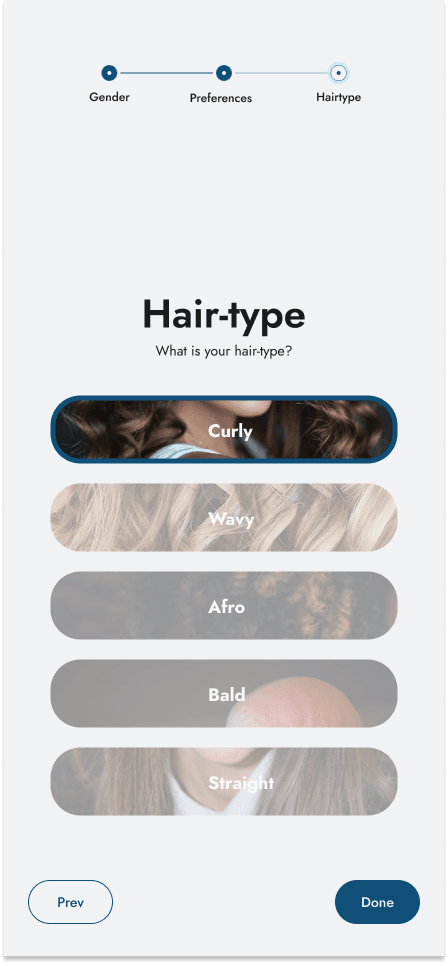
Hair-type options were a plain list of labels.
After testing
Swapped in photo tiles per option — testers picked their hair type almost twice as fast when they could see it.
Before
Choosing a professional and a slot felt like guesswork with no trust signal.
After testing
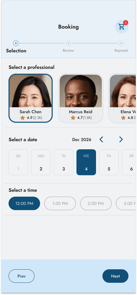
Added a photo, rating, and review count to every professional card, plus an explicit Selection → Review → Payment stepper before anything is booked.
03 — Refine
From wireframe to a real product feel.
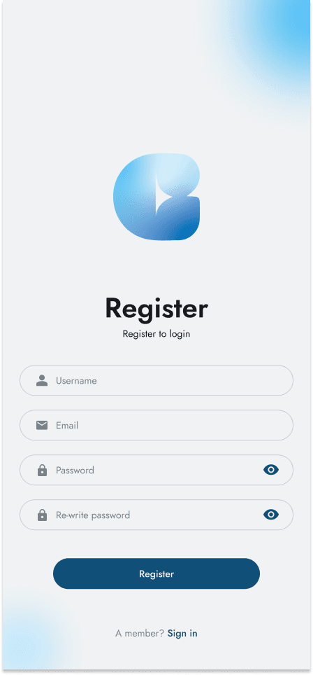
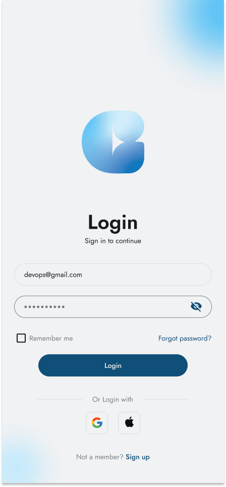
Once the flow held up in testing, I carried it into a soft, trustworthy visual language — a warm blue gradient mark, one question per screen, and a stepper that always shows how much is left.
04 — Deliver
Book a slot in three taps.
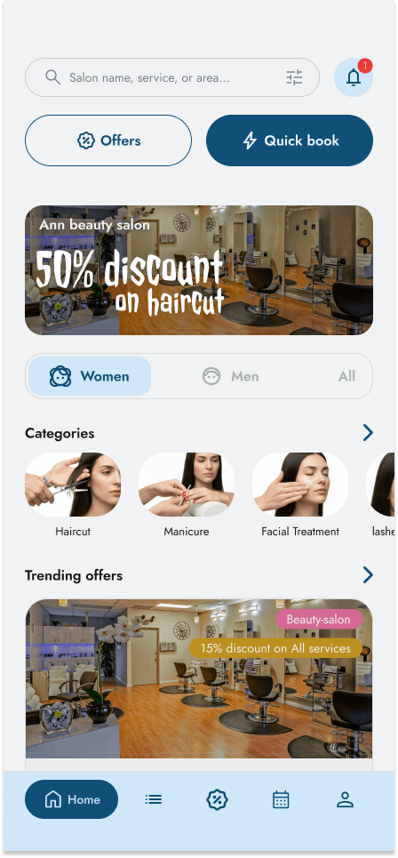
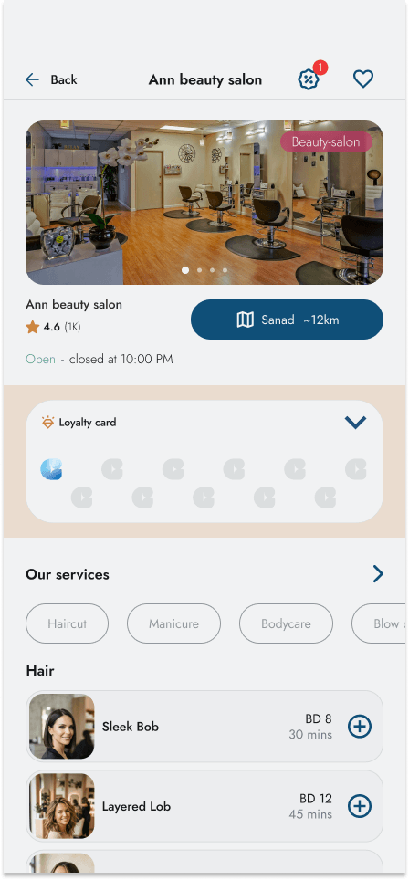
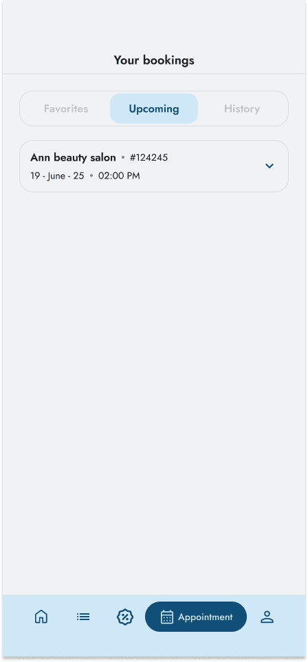
The flow that mattered most: from browsing salons, to picking a trusted professional and a time, to a booking you can see confirmed in your own list — no line, no guessing.
The hardest part
The real struggle wasn't the interface — it was balancing what made booking effortless for the user against what made it sustainable for the business. A free, no-commitment slot is easy for a customer to abandon, and an empty chair is revenue a salon never gets back.
That tension is why the booking flow ends in a Selection → Review → Payment stepper instead of a single tap: still fast for the user, but it asks for a real commitment before a slot is held, so the salon isn't left guessing who actually shows up. The loyalty card on every vendor page carries the same trade-off — a small reward for the customer, a reason to come back for the business — built as one component instead of two competing goals.