Web App · Salon Operations · 2026
Glowva CRM
The half of Glowva a customer never sees: the dashboard staff and managers use to run walk-ins, schedules, and performance across every branch, once a booking becomes a real person at the door.
Role
Solo Designer
Users
Staff & Managers
Surfaces
Booking · Staff · Reports
01 — Context
Booking the slot was only half the job.
The Glowva mobile app solved booking for the customer. But once that appointment turned into a real person walking through the door — or a walk-in with no booking at all — someone on the salon side had to run it: check them in, take payment, keep every barber's calendar straight, and know which branch and which staff member were actually pulling their weight. Glowva CRM is that side of the product — built for the people working the floor, not the people getting the haircut.
02 — Command center
“How's today going”, answered in one screen.
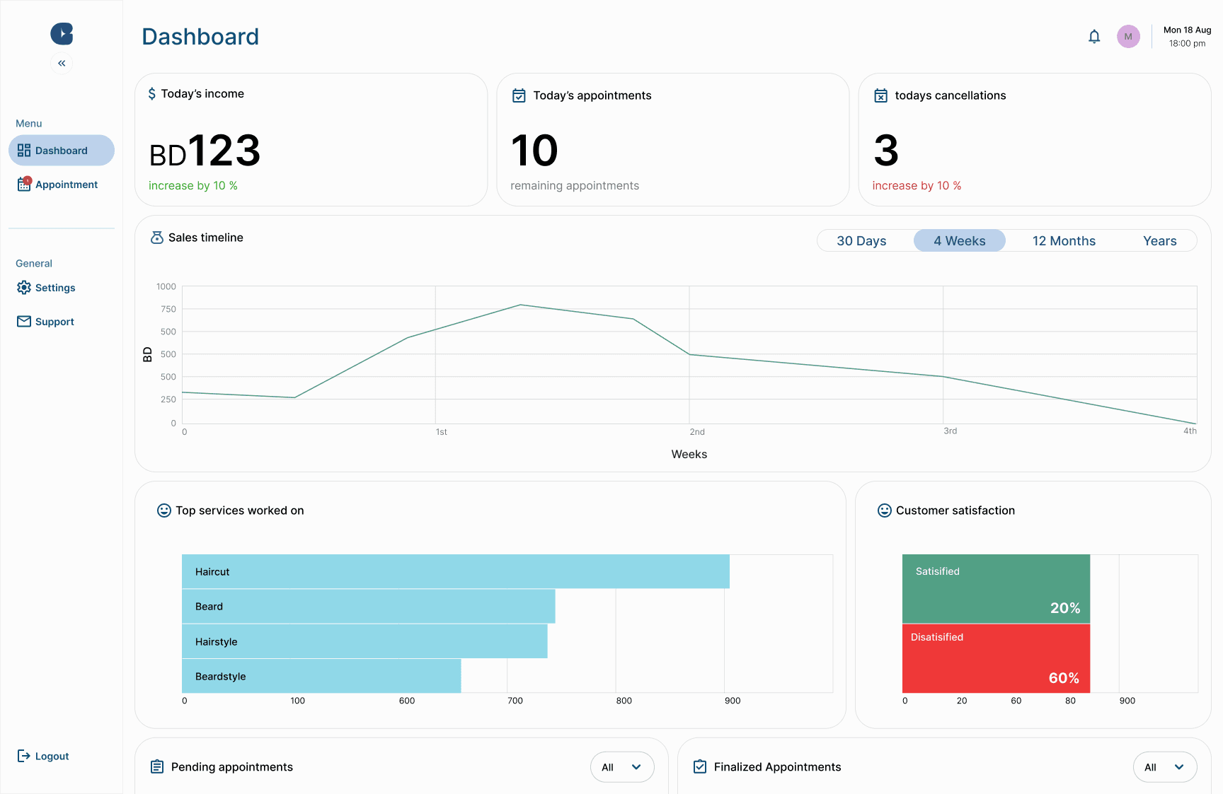
Today's income, remaining appointments, and cancellations sit above the fold, followed by a sales timeline, top services, and a satisfaction split — so a manager opening the dashboard between customers gets the full picture without hunting for it.
03 — The floor, live
A calendar that matches how a salon actually runs.
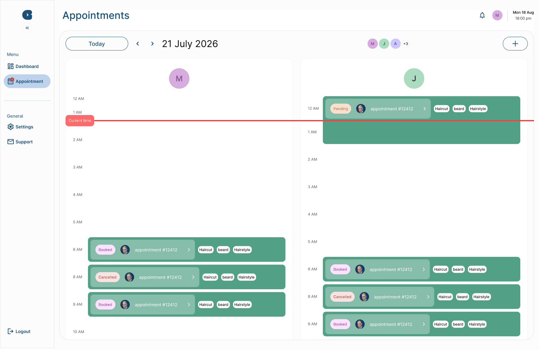
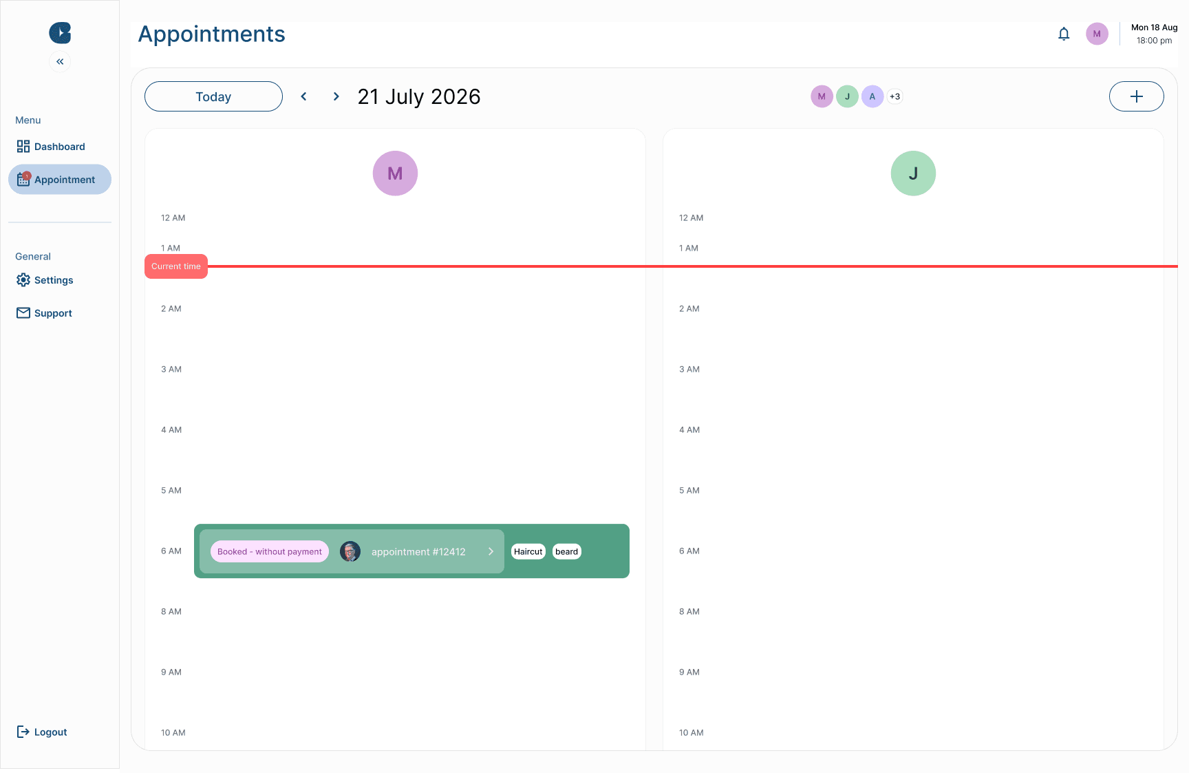
Every staff member gets their own column for the day, with a live current-time line so nobody has to ask “what's next”. Status is color-coded and explicit — booked, pending, cancelled, or booked without payment — because a busy front desk shouldn't have to open an appointment to know what it is.
04 — Walk-ins, without the pause
Checkout as fast as the haircut was.
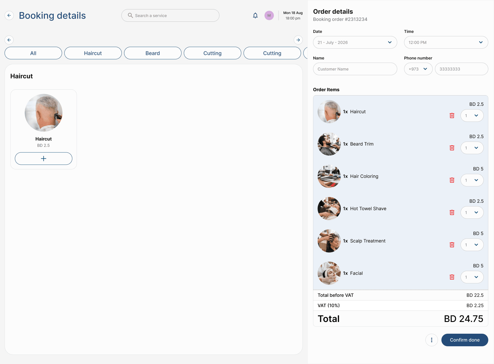
Pick services from a category list, and the order, VAT, and total build themselves on the right — no separate till, no re-entering what was already said out loud. A walk-in with no account can be checked in, served, and checked out from the same screen.
05 — Staff, across branches
One roster, however many branches you run.
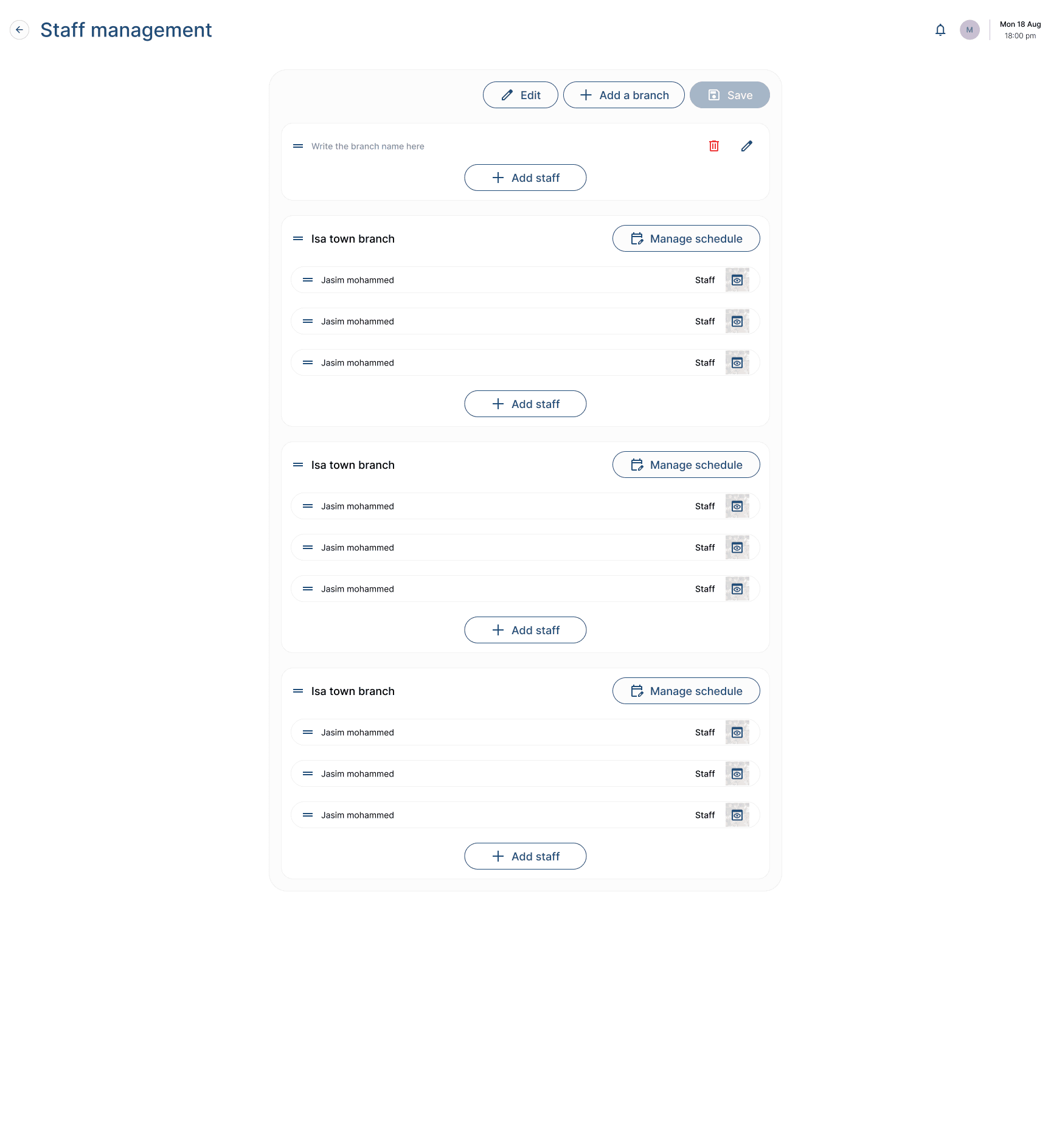
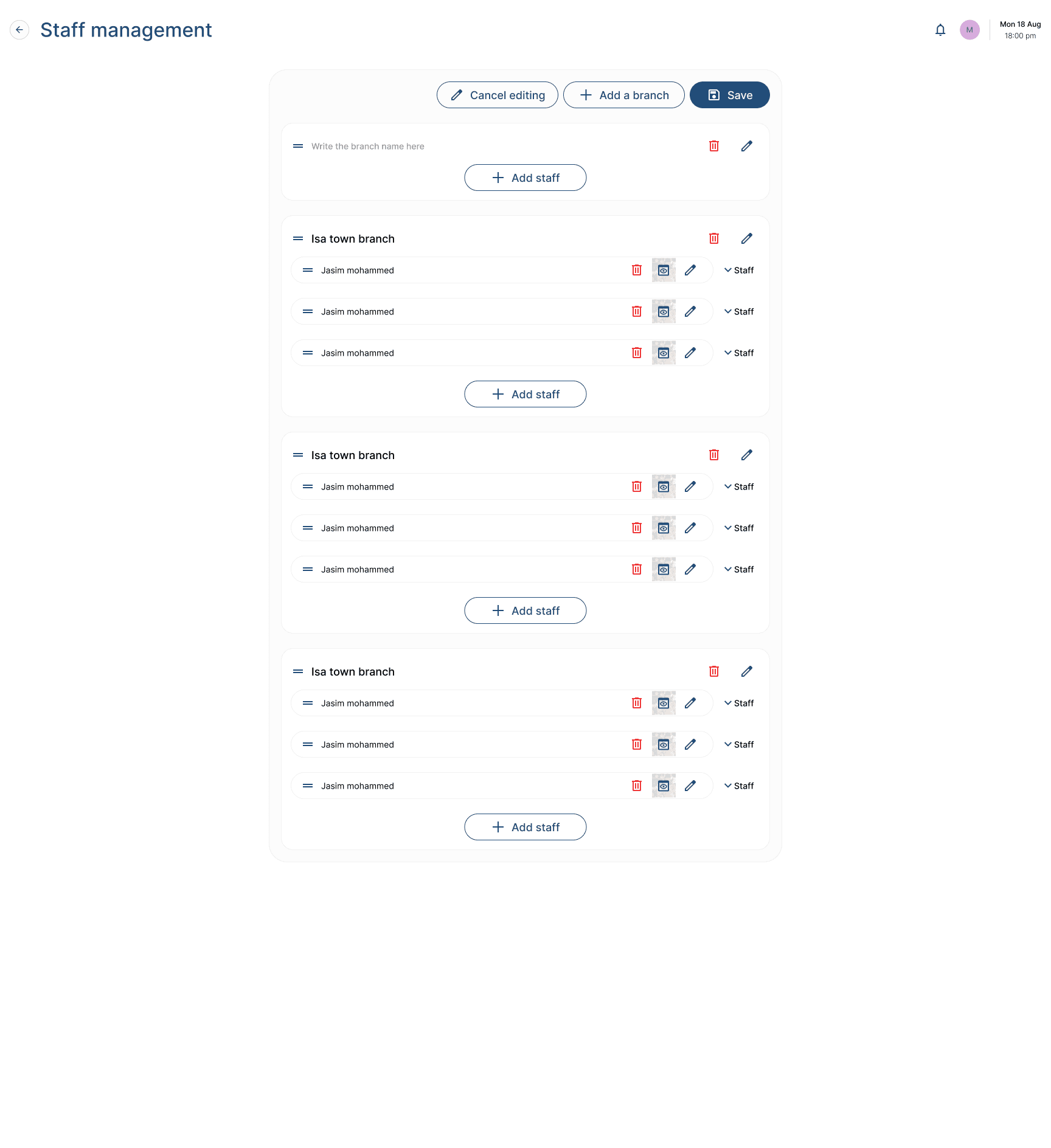
Each branch collapses into its own roster with an explicit edit mode — drag to reorder, rename, or remove a branch or a staff member without touching anything else, and hand off scheduling per branch instead of one tangled list.
06 — Who's actually performing
From the whole team to one person, in a click.
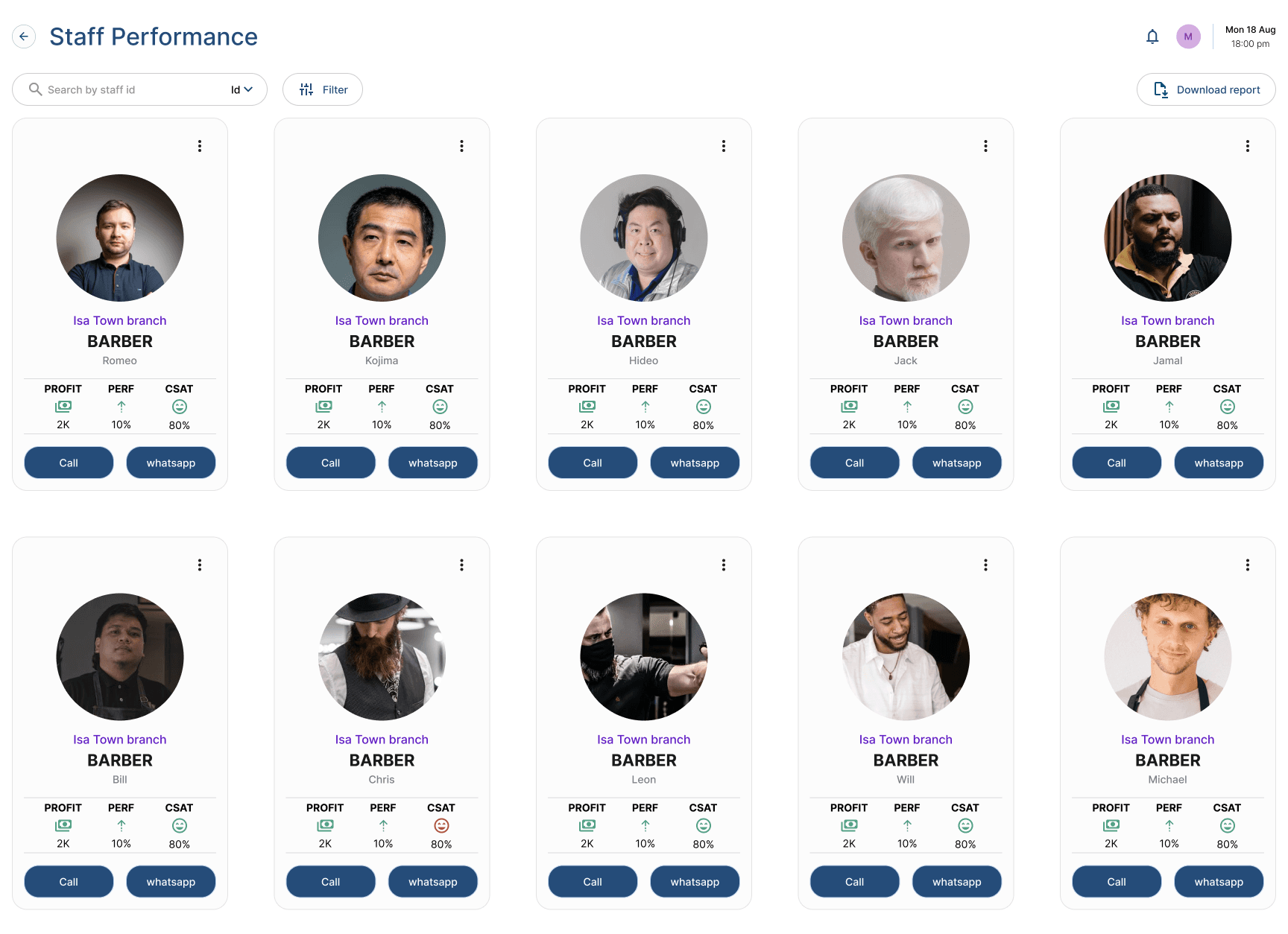
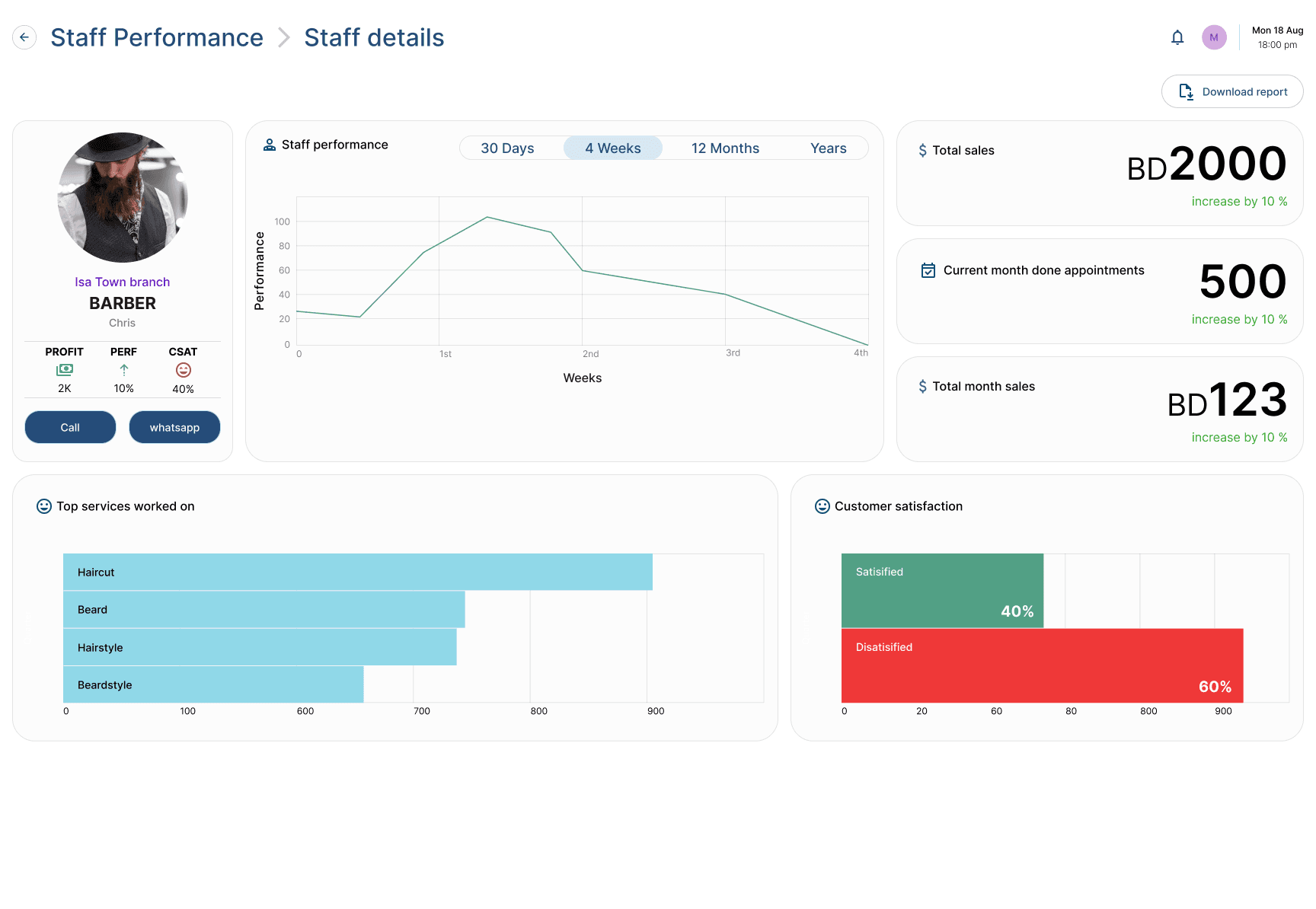
Every barber's profit, performance, and customer satisfaction sit on one card, with call and WhatsApp actions already there — and drilling into any one of them opens the same story at the individual level: sales trend, appointments done, and what customers actually thought.
What this taught me
The same product had to hold two completely different paces.
The dashboard and performance screens could afford density — a manager sits with those, reading charts between appointments. But the appointments board and the checkout screen get used mid-haircut, by someone who can't stop to read: those had to survive a three-second glance, which is why status is a color and a word, never a number to interpret. Designing both inside one visual language, without either one compromising the other, was the real work.